My Fortnite Frustration: A Clunky New UI and the Quest for Simplicity
Epic Games' major Fortnite UI overhaul transforms the quest system into a puzzling labyrinth, frustrating veterans with its clunky navigation and time-consuming menus. While it consolidates quests across modes, the new interface often hinders gameplay, making even exciting Godzilla quests a chore.
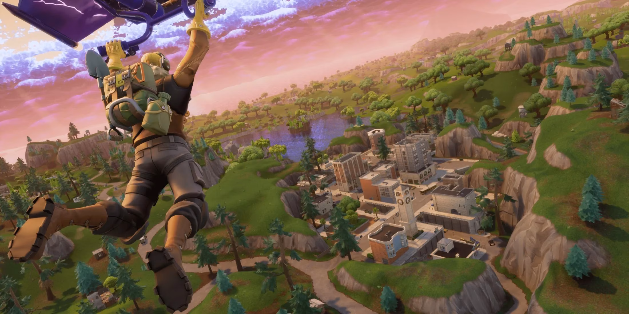
It's 2026, and I'm booting up Fortnite for my daily dose of chaos, only to be greeted by an interface that feels like it's trying to solve a puzzle I never asked for. Epic Games, in their infinite wisdom, decided to give the quest system a major facelift, and let me tell you, it's been... an experience. We're in the thick of Chapter 6 Season 1, which honestly started off feeling like a breath of fresh air with its slick new movement and that gorgeous, sprawling map. But this latest UI overhaul? It's got a large chunk of us veterans scratching our heads, and not in a good way.
The Quest Menu Maze 🧩
Remember when quests were just a simple, straightforward list? Yeah, those days are gone. Now, everything's broken up into these big, chunky, collapsible blocks. At first glance, I'll admit, it looks clean—almost too clean. But the moment you dive in, you realize you're navigating a labyrinth of submenus. It's like they took a simple grocery list and turned it into a multi-level department store map. Finding what you need isn't intuitive anymore; it's a chore.
Here’s the kicker, though: for some players, this new system is actually a blessing. Before, if you wanted to check quests for different modes—say, the frantic Reload or the nostalgic Fortnite OG—you had to physically switch modes in the lobby. That was a pain! Now, in theory, they're all accessible from one place. But in practice... well, that's where the real trouble starts.
When Time is of the Essence (And the UI Isn't) ⏱️
The absolute worst part hits you mid-match. Fortnite is a game where seconds count. You're looting, building, listening for footsteps, and you quickly need to check a quest step. With the old system, it was a quick glance. Now? You're clicking, collapsing, expanding, scrolling... it's a whole production number! I can't tell you how many times I've been caught with my digital pants down, menu-deep, only to hear the dreaded sniper rifle crack and see the 'Eliminated' screen. Trying to complete those awesome new Godzilla quests became an exercise in frustration—more time fighting the interface than the actual monsters or other players. Talk about a vibe killer!
A Silver Lining (With a Funky Beat) 🎸
Okay, okay, I don't want to sound like I'm just whining. Because amidst this UI confusion, Epic did drop something pretty cool. Remember all those instruments from Fortnite Festival? As of now, most of them can be used as pickaxes and back blings in the main battle royale! How awesome is that? I can now smash through walls with a neon guitar or rock a keytar on my back. It's a small but fantastic cosmetic win that gives us so many more options for personalizing our loadouts. It’s the kind of fun, player-friendly addition that reminds me why I love this game.
| The Good | The Not-So-Good |
|---|---|
| All quests in one place (theoretically) | Clunky, nested menu navigation |
| Festival instruments as cosmetics! 🎷 | Major time-waster during matches |
| Clean initial visual appearance | Feels less intuitive for veterans |
Looking Ahead...
So, where does that leave us? The community's feelings are mixed, like a loot llama that dropped mostly wood. There's genuine frustration over a system that slows down gameplay, but also appreciation for the continued support and wild collaborations (who could forget the Winterfest with Shaq and Snoop?). The core game is still incredibly strong. The movement feels great, the map is alive, and modes like LEGO Fortnite: Brick Life offer a completely different kind of fun.
I guess my hope is that Epic is listening. Maybe this new UI is a foundation they'll refine. Perhaps they'll streamline those menus based on our feedback. Because at its heart, Fortnite is about fast-paced, accessible fun. The current quest UI, bless its heart, feels like it's forgetting that. It's a step towards organization that tripped over its own feet. But hey, at least I can do it all while looking fabulous with my new drum-set back bling. Here's hoping the next update finds a better balance between form and function.
Comments